BBC
Media TV Broadcasting


2015
London, UK
BBC TV Home
Making live TV easier to discover, choose and plan across every screen.
I redesigned BBC iPlayer TV Home to combine editorial discovery with a channel-by-channel view of what was on now and next. As Senior User Experience Designer, I shaped the responsive experience across desktop, tablet and mobile, from research and wireframes through prototyping and testing.
- 3 device formatsResponsive device coverageThe redesigned TV Home experience shipped across desktop, tablet-width, and mobile layouts.Reported
Context
In 2015 I worked as Senior User Experience Designer on BBC TV Home in London. The page had to serve two different needs in one place: help viewers discover something compelling to watch, and help them make a quick decision about live and upcoming programmes across BBC channels.
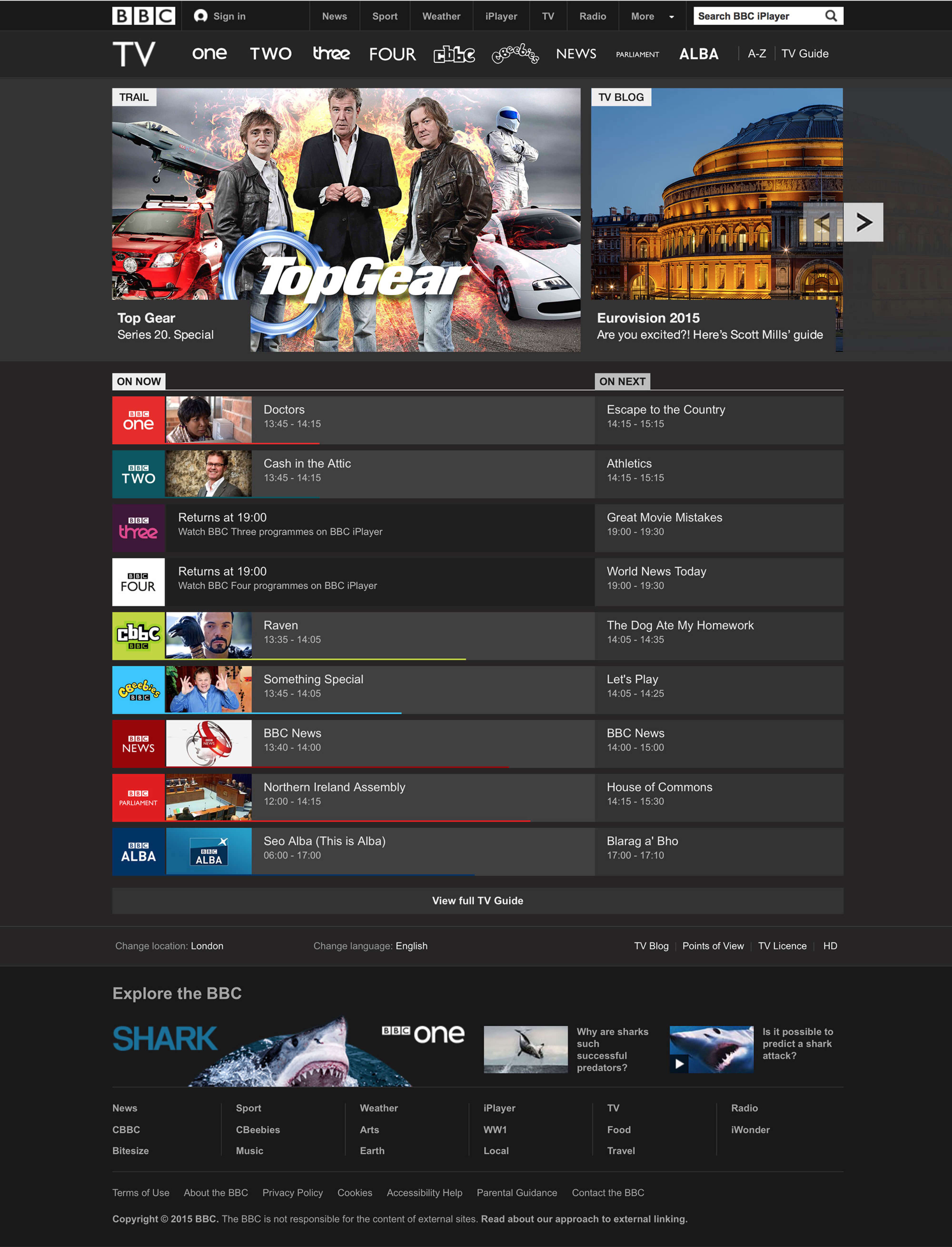
The experience combined a prime-time programme carousel with a channel-by-channel view of what was on now and next. Viewers could move from editorial discovery into live viewing or continue into the wider TV schedule.
I worked from existing behavioural data and research through concepts, wireframes, interaction design, prototypes and testing with marketing, product, research and engineering colleagues.
Challenge
Viewers had difficulty discovering live television, finding what was on next and planning prime-time viewing. The challenge was to make a content-rich homepage useful without turning it into an overloaded TV guide.
The design needed a clear route from editorial discovery to immediate live viewing, while preserving a deeper route for people who wanted the full schedule. Discovery and utility had to share one surface without competing for attention.
The experience also needed to work across desktop, tablet and mobile. The responsive solution could not simply compress the desktop layout. It had to preserve the distinction between choosing something now and planning what to watch next.
Approach
I worked with research and existing behavioural data to understand how viewers moved between editorial discovery and live programming. Surveys, interviews and usability testing exposed two recurring needs: viewers wanted a faster route to live programmes and clearer visibility of what was next, especially during prime-time viewing.
I translated those findings into concepts and blocked-out wireframes, then tested the hierarchy before moving into visual design.
The core pattern stayed consistent across breakpoints:
- Featured content first.
- A channel-based ON NOW / ON NEXT view second.
- A clear route to the full TV Guide.
The design was reviewed through mockups and testing across desktop, tablet-width and mobile layouts.
Decisions
I put a prime-time carousel above the schedule so editorial discovery and live utility could coexist rather than compete across separate destinations.
I separated ON NOW from ON NEXT so viewers could distinguish an immediate viewing decision from planning ahead.
I kept channel identity and repeated programme rows consistent across breakpoints. On desktop, the schedule could appear side by side. On mobile, the same distinction became two tabs followed by a vertical channel list.
I also retained direct routes to On now and View full TV Guide, so the homepage could support both quick decisions and deeper schedule browsing.
Results
The resulting TV Home experience connected programme discovery with live-TV planning in one page.
The carousel surfaced featured prime-time programmes, while the channel-by-channel ON NOW / ON NEXT listing gave viewers a direct route to current and upcoming broadcasts.
The layout shipped across desktop, tablet-width and mobile. The mobile version used tabs to preserve the same distinction in a narrower viewport.
No quantitative outcome is recorded for this version, so these are qualitative product and delivery outcomes rather than measured performance claims.
Reflection
I would have tested the balance between editorial discovery and live utility earlier, before the visual hierarchy became too settled. The central tension was not simply where to place a carousel. It was how much editorial emphasis the page could carry before the TV guide stopped feeling immediate.
The durable lesson was to preserve the user's decision context across breakpoints. A responsive redesign should not merely compress the desktop layout. It should retain the distinction between choosing something now and planning what to watch next.
Prototype
Prototypes and mockups were produced across screen sizes so the carousel and channel guide could be reviewed as a working layout rather than as isolated static screens.
The desktop mockups showed two states: the above-the-fold carousel with the first channel rows, and the page scrolled to reveal the full eight-channel ON NOW / ON NEXT guide.
The responsive review covered desktop, tablet-width and mobile layouts. On mobile, ON NOW and ON NEXT became tabs so the same channel-by-channel guide could fit a narrow screen.
Tools & Skills
Crafted the initial concepts and defined the scope of the TV Home carousel and channel guide.
Structured the page in blocked-out greyscale wireframes before moving into visual design.
Designed the user experience, interface and interaction across the carousel and ON NOW/ON NEXT schedule.
Built working mockups across desktop, tablet-width and mobile to review the responsive layout.
Tested combinations of layout and content to refine the design.
Compared design variants to determine which performed better with users.
Worked with marketing, creative direction, product management, user research, user testing, engineering and development.
Tech Stack & Methods
Adapted the carousel and channel guide across desktop, tablet-width and mobile layouts.
Balanced editorial programme discovery with immediate live viewing and forward schedule planning.
Organised live and upcoming programmes by channel so viewers could scan the schedule quickly.
Used variant testing to compare combinations of layout and content.
Reviewed working mockups and responsive states before the final visual design.
Accessibility & UX
The responsive design preserved the distinction between ON NOW and ON NEXT across screen sizes, helping viewers understand whether they were choosing something to watch immediately or planning ahead.
On mobile, the two states became tabs rather than disappearing into a compressed schedule. This retained the same information architecture within a narrower viewport.
The available record supports responsive interaction and content hierarchy decisions. It does not include a formal accessibility audit or measured accessibility outcome.
Experimentation & Rollout
The design was developed and reviewed through research, concepts, blocked-out wireframes, prototypes, mockups and testing.
Testing examined combinations of layout and content across the carousel, channel rows and ON NOW / ON NEXT structure.
The final responsive pattern was prepared for rollout across desktop, tablet-width and mobile. The three-format coverage is a delivery outcome, not a claim about audience adoption or performance.
Disclaimer
Some information and details are omitted because of confidentiality constraints.
This case study represents my work and does not necessarily reflect the views or strategies of the BBC.
Portfolio material is presented under Fair Dealing guidelines. No confidential or proprietary BBC information has been disclosed.
Handling of information follows the Data Protection Act 2018 and the Computer Misuse Act 1990. Fair dealing is claimed under Sections 29 and 30 of the Copyright, Designs and Patents Act 1988.
<p>Portfolio material is presented under Fair Dealing guidelines. No confidential or proprietary BBC information has been disclosed.</p>
Key facts
- Client
- BBC
- Year
- 2015
- Role
- Senior User Experience Designer
- Industry
- Media TV Broadcasting
- Location
- London, UK
- Responsive device coverage
- 3 device formats
What was the challenge in BBC TV Home?
Viewers had difficulty discovering live television, finding what was on next and planning prime-time viewing. The challenge was to make a content-rich homepage useful without turning it into an overloaded TV guide.
What did I actually do on BBC TV Home?
I worked with research and existing behavioural data to understand how viewers moved between editorial discovery and live programming. Surveys, interviews and usability testing exposed two recurring needs: viewers wanted a faster route to live programmes and clearer visibility of what was next, especially during prime-time viewing.
What was the outcome of BBC TV Home?
The resulting TV Home experience connected programme discovery with live-TV planning in one page . Measured outcomes: Responsive device coverage: 3 device formats.