The Savile Row Company Ltd
Luxury Menswear Fashion


2014
London, UK
The Savile Row Company
Rebuilding a desktop-only Magento storefront into a responsive luxury menswear experience.
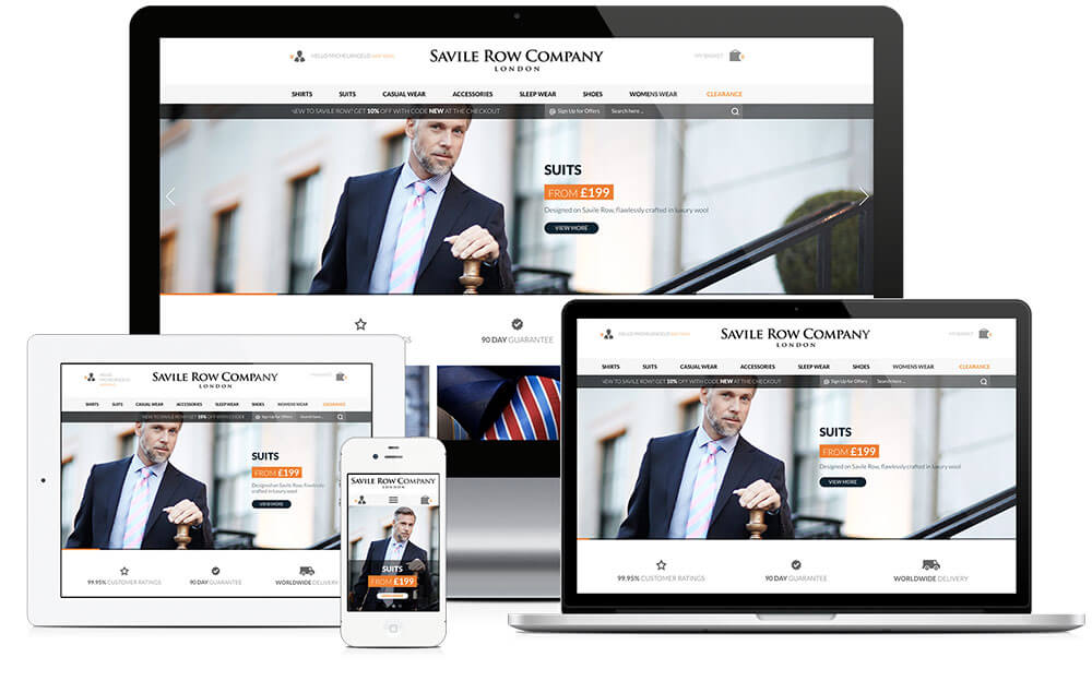
I led the responsive rebuild of The Savile Row Company’s Magento storefront, covering information architecture, wireframing, responsive UX and UI, CMS merchandising modules, front-end implementation and Magento delivery across desktop, tablet and mobile.
My decisions, bets and trade-offs
- Decision
I chose a shared responsive template system over a separate mobile site because it kept navigation, trust messaging and cross-selling consistent while letting each layout adapt to available space. Why
- Decision
I defined the grid and information architecture before drawing the full templates, which gave the storefront shared structure rather than a collection of individually optimised pages. Why
- Bet
I added a product-detail cross-link and quick-view popover because I believed in-context information was more relevant at that stage, then used A/B tests and customer surveys to check that belief. Why
- Trade-off
I chose reusable CMS banner variants instead of independent seasonal placements, accepting a more constrained component system so merchandising could publish campaigns repeatedly across the site. Why
- 1264px to 320pxResponsive storefront device rangeA single responsive Magento storefront operated across desktop and mobile screen sizes, replacing the desktop-only build.Reported
- 5 breakpointsResponsive breakpoint coverageDocumented breakpoint rules enabled Magento templates to scale predictably from desktop to mobile.Reported
- 6 pillarsInformation architecture coverageThe site structure was mapped across six core information pillars before template design.Reported
- 5Responsive grid breakpoint coverageDocumented a five-breakpoint responsive grid spanning desktop through mobile layouts.
Context
For The Savile Row Company Ltd, a family-run luxury menswear retailer trading from Mayfair, London since 1938, I led the responsive rebuild of its Magento eCommerce storefront.
My work covered information architecture, wireframing, responsive UX and UI design, the CMS banner system, front-end implementation and Magento delivery. The goal was to replace a desktop-oriented storefront with one coherent experience across desktop, tablet and mobile.
The resulting system covered the homepage, category pages, product listings and product-detail pages, with shared navigation, merchandising patterns and responsive behaviour.
Challenge
The existing Magento storefront had not been designed responsively, even as more customers browsed on tablets and mobile devices.
Product pages were particularly demanding. Customers needed to inspect garments, select size and fit, choose customisation options, understand delivery and returns, and compare related products without losing the premium character of the brand.
The merchandising team also had to create seasonal banners manually for different placements. The project therefore had two connected challenges: make the shopping experience usable on smaller screens, and create a more reusable foundation for campaign content.
Approach
I began by auditing the existing storefront, catalogue structure and Magento templates. I then mapped the information architecture and used template and product-detail wireframes to establish structure before moving into visual design and implementation.
The responsive system was defined through a documented grid and reusable page patterns. The work covered the homepage, category pages, product listings and product detail, including image inspection, product options, size guidance, customisation, delivery information and cross-selling.
Rather than treating promotional content as one-off artwork, I defined reusable CMS banner variants for carousels, category placements and homepage tiles. This allowed the same campaign content to be recomposed across the storefront.
Decisions
I organised the site around six information pillars:
- About Us and Legal
- Products
- User Account
- Service Support
- Blog and News
- Social Network
This structure separated product discovery from the reassurance content needed during a considered luxury purchase, including delivery, returns, size guidance, customisation and Made to Measure services.
I chose a shared responsive template system rather than a separate mobile site. That kept the navigation, trust messaging and cross-selling logic consistent while allowing each layout to adapt to the available space.
I also chose a reusable CMS banner model instead of designing each seasonal placement independently. The trade-off was a more constrained component system, but it gave the merchandising team a repeatable way to publish campaigns across the site.
at prouct details page ther was a cross link to the landing page and apopover for quick view provising in context infoemation at that stage as more relevant for th euser. we ab tested and researched with some forms survey with top returning customers
Results
The project delivered one responsive Magento storefront replacing the desktop-only build.
The homepage, category, listing and product-detail templates shared the same navigation, trust messaging and cross-selling logic across screen sizes. The documented responsive system operated from a 1264px desktop breakpoint down to a 320px mobile breakpoint.
The CMS banner system supported campaigns including Formal Shirts, 4 for £100, New Season 2014/15, Our Fits, Customisation and Look Book. These could be recomposed across carousels, category banners and homepage tiles without creating a new bespoke design for every placement.
Reflection
The most useful decision was to define the grid and information architecture before drawing the full set of templates. That gave the storefront a shared structural logic instead of a collection of individually optimised pages.
The CMS banner work reinforced the same lesson. Treating campaign content as a set of documented variants made the system easier to reuse than treating every banner as a finished graphic.
The work also exposed the limits of a responsive rebuild. A stronger next phase would have tested the responsive product-detail experience with shoppers earlier, particularly around fit, customisation and the amount of reassurance needed before purchase.
Prototype
The detailed product-detail wireframe acted as the interactive prototype for stakeholder review before visual design and Magento development.
It covered image gallery and zoom, product options, size guidance, customisation, quantity, add-to-basket, ratings, delivery and returns, Complete the Look, related products and recently viewed items.
Tools & Skills
Designed the end-to-end shopping experience across discovery, browsing, product evaluation and purchase.
Created the responsive visual system for homepage, category, listing and product-detail templates.
Mapped the storefront into product, account, service, editorial and social areas.
Defined responsive page structure and product-detail interactions before visual design and implementation.
Documented responsive behaviour, layout rules and reusable component patterns for implementation.
Worked across design, engineering, merchandising and business stakeholders to deliver the storefront.
Tech Stack & Methods
Documented five breakpoints at 1264px, 1024px, 760px, 480px and 320px.
Retained Magento as the commerce and CMS platform while rebuilding the front end responsively.
Defined reusable banner variants for carousels, category placements and homepage tiles.
Built responsive templates against the documented grid using HTML5 and CSS3.
Used testing tools to compare merchandising and layout variations where available.
Experimentation & Rollout
The storefront was implemented as one Magento template system across desktop, laptop, tablet and mobile rather than as a separate mobile site.
Multivariate and A/B testing tools were available to validate merchandising and layout decisions, including banner variants and product-listing density. The CMS banner module also supported campaign reuse across carousels, category banners and homepage tiles.
Disclaimer
Some information and details have been excluded for confidentiality reasons.
This case study is presented for portfolio purposes and follows Fair Dealing principles. It does not disclose confidential or proprietary information belonging to The Savile Row Company.
The material represents my work and perspective on the project and does not necessarily reflect the views or strategies of The Savile Row Company.
Data Protection Act 2018 and the Computer Misuse Act 1990 Fair dealing Disclaimer Sections 29 and 30 of the Copyright, Designs and Patents Act 1988.
Key facts
- Client
- The Savile Row Company
- Year
- 2014
- Role
- Digital Art Director & Senior UX Designer
- Industry
- Luxury Menswear Fashion
- Location
- London, UK
- Responsive storefront device range
- 1264px to 320px
- Responsive breakpoint coverage
- 5 breakpoints
- Information architecture coverage
- 6 pillars
- Responsive grid breakpoint coverage
- 5
What was the challenge in The Savile Row Company?
The existing Magento storefront had not been designed responsively , even as more customers browsed on tablets and mobile devices.
What did I actually do on The Savile Row Company?
I began by auditing the existing storefront, catalogue structure and Magento templates . I then mapped the information architecture and used template and product-detail wireframes to establish structure before moving into visual design and implementation.
What was the outcome of The Savile Row Company?
The project delivered one responsive Magento storefront replacing the desktop-only build. Measured outcomes: Responsive storefront device range: 1264px to 320px; Responsive breakpoint coverage: 5 breakpoints; Information architecture coverage: 6 pillars; Responsive grid breakpoint coverage: 5.