Watsons
Pharmacy & Drugstore


2013
London, UK
Watsons Mobile Commerce System
Designing a localisable mobile commerce system for campaign discovery, product browsing and store finding across Asian markets.
As Senior Mobile UI Designer, I designed Watsons mobile commerce concepts and an implementation-ready style guide for regional teams. The system covered campaign discovery, product browsing, filters, product detail, store finding, localization and reusable UI patterns across multiple Asian markets.
My decisions, bets and trade-offs
- Decision
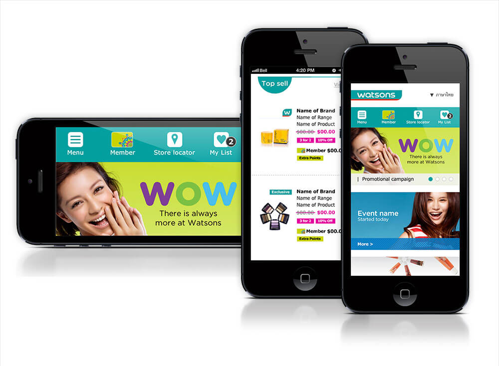
I chose a persistent utility bar for Menu, Member, Store locator and My List so shoppers could reach core actions one tap away while campaigns rotated above. Why
- Bet
I assumed the system could roll out across regional business units, and I checked that assumption with a three-screen concept showing the same structure in Chinese and Thai. Why
- 4 marketsRegional market coverageStyle-guide system referenced four Asian markets for regional implementation.Reported
- 2 language interfacesLocalized language interface coverageThe concept demonstrated localized Chinese and Thai market interfaces.Reported
Context
Watsons, Asia's leading pharmacy and health and beauty retailer, worked with WHAM, its London-based brand agency, to take the Looking Good, Feeling Great campaign onto mobile.
As Senior Mobile UI Designer, I designed the mobile concepts and produced the implementation-ready style guide that enabled regional teams to build consistently across multiple Asian markets.
The system covered campaign-led discovery, product listings, filters, product detail, store finding and localized market versions, including Chinese and Thai language interfaces.
The guide documented branding, responsive structure, photography, navigation, icons, filters, product panels and store-locator states.
Challenge
Watsons needed to present a large catalogue spanning pharmacy, beauty, personal care, hair and health while also supporting promotional campaigns, membership features, saved products and store discovery on a 2013-era mobile screen.
The navigation had to accommodate broad categories such as Skincare, Make Up, Men, Personal Care, Hair and Health without burying essential retail utilities.
A campaign-heavy homepage could easily crowd out repeat-use functions such as loyalty, saved products and nearby-store discovery. The design challenge was to combine promotional storytelling with a persistent utility bar containing Menu, Member, Store locator and My List, keeping core actions one tap away while campaigns rotated above.
Product-list rows also needed to communicate thumbnails, brands, product ranges, names, original and sale prices, promotion badges, Exclusive labels, member pricing and Extra Points within a small footprint.
Approach
WHAM and Watsons worked through a close agency-client collaboration focused on high-quality pixel output and an implementation-ready workflow.
I developed mobile concepts alongside detailed specifications covering exact dimensions, component rules, interaction states, localization requirements and image-weight budgets. This allowed regional teams to build consistently without repeatedly re-deriving the design.
The solution connected promotional discovery, structured browsing and detailed product evaluation. Product pages carried pricing, promotion and member-price treatments while adding colour selection, product codes, sharing, expandable information sections, embedded how-to video, numbered application steps and related products.
Decisions
I designed the experience around a persistent utility layer containing Menu, Member, Store locator and My List. This kept repeat-use retail functions available without allowing campaign content to dominate every interaction.
The store locator became a dedicated flow. Shoppers could select a region and district, search by street, filter by services such as Beauty Institute, Pharmacy or Beauty, and switch between map and list views.
Category browsing used Category, Sort By, list/grid switching and Filter Options. Map pins and distance-ranked list rows provided Full details, View on map and Get directions actions.
I chose a constrained but adaptable system. The style guide defined shared visual and interaction rules, while regional teams could configure filters, language layers and market-specific content without redesigning the whole experience.
Results
The delivered output was a reusable mobile eCommerce and UI system covering campaign discovery, category browsing, filters, product detail, video-led product guidance and dual-view store finding.
The supporting guide documented colour, logos, navigation, icons, photography formats, page grids, filter behaviour, product-panel dimensions and map states.
The product panels specified 200 × 200px thumbnails, brand and range labels, product names, crossed-out RRP, sale price, promotion badges, member pricing and Extra Points.
The system enabled regional teams to implement the experience without re-deriving the design from scratch. No measured adoption or commercial outcomes are recorded for this project, so these are delivery and coverage outcomes rather than performance claims.
Reflection
The key lesson was that a regional design system must specify both constraints and flexibility.
Rules such as a recommended three-to-five filters, exact image-weight budgets and standardized map behaviour created consistency. Configurable filter counts and market-specific language layers allowed the same system to adapt across countries without drifting apart.
The project also showed that localization is not only a translation task. It affects content length, navigation labels, filters, market conventions and the boundaries of what can be standardized.
The documentation anticipated further standardization across Watsons business units, particularly for the store-locator map and icon system. Its broader direction was a shared regional foundation supporting new markets, languages, categories, campaigns and localized business requirements.
Prototype
The filter experience was specified through multiple interaction states: collapsed, expanded Filter Options, a scrollable brand checklist with selected and unselected states, and an applied-filter state with removable chips and Clear all.
The documentation allowed up to 10 filter options to be customized by business unit while recommending three to five filters for the final experience.
The store-locator concept also specified a 560 × 860px map, service-specific pin behaviour and map/list switching.
Tools & Skills
Designed eCommerce concepts for campaign discovery, product listing, product detail and store finding on early-smartphone screens.
Produced pixel-accurate, implementation-ready screens across the full mobile shopping flow.
Authored the colour, navigation, iconography, product-panel and photography specifications used by regional teams.
Documented multiple UI states for filters, product sections, map views and store-finding interactions.
Designed one interface system that could be rebuilt in Chinese and Thai for different regional markets.
Structured category browsing, filtering and store-locator flows for a large multi-category catalogue.
Tech Stack & Methods
Defined a browser-centred mobile structure with a 640 × 260px header, 560px content area and 640 × 1100px footer.
Specified a 10 × 10px page grid to support consistent layout and implementation across regional teams.
Documented language, market and content variations for Chinese, Thai and other regional implementations.
Defined map and list states, service filters, pharmacy-specific pin behaviour and distance-ranked store results.
Specified product thumbnails, labels, prices, promotion states, member pricing and Extra Points.
Included image-weight requirements in the implementation documentation to support a practical mobile experience.
Accessibility & UX
The interface separated promotional content from essential retail utilities so customers could reach membership, saved products and store finding without navigating through campaign content.
The product and filter specifications made important states explicit, including selected and unselected filters, removable filter chips, member pricing, promotion badges and service-specific store pins.
The available record supports interaction clarity and state specification. It does not include a formal accessibility audit or measured accessibility outcome.
Experimentation & Rollout
The interface system was designed for rollout across regional business units rather than a single market.
A three-screen concept demonstrated the same structure across languages, including a Chinese toggle and a pixel-identical Thai-market version. Style-guide artefacts also referenced Malaysia, Singapore, Hong Kong and the Philippines.
Regional components such as the store-locator map were marked for confirmation before becoming group standards. The system was designed to travel across markets without requiring each team to redesign the experience from scratch.
Disclaimer
Some information and details are omitted because of confidentiality constraints.
This case study represents my work and does not necessarily reflect the views or strategies of Watsons.
This portfolio material is presented under Fair Dealing guidelines. No confidential or proprietary Watsons information has been disclosed.
<p>Portfolio material is presented under Fair Dealing guidelines. No confidential or proprietary Watsons information has been disclosed.</p>
Key facts
- Client
- Watsons
- Year
- 2013
- Role
- Senior Mobile UI Designer
- Industry
- Pharmacy & Drugstore
- Location
- London, UK
- Regional market coverage
- 4 markets
- Localized language interface coverage
- 2 language interfaces
What was the challenge in Watsons Mobile Commerce System?
Watsons needed to present a large catalogue spanning pharmacy, beauty, personal care, hair and health while also supporting promotional campaigns, membership features, saved products and store discovery on a 2013-era mobile screen.
What did I actually do on Watsons Mobile Commerce System?
WHAM and Watsons worked through a close agency-client collaboration focused on high-quality pixel output and an implementation-ready workflow .
What was the outcome of Watsons Mobile Commerce System?
The delivered output was a reusable mobile eCommerce and UI system covering campaign discovery, category browsing, filters, product detail, video-led product guidance and dual-view store finding. Measured outcomes: Regional market coverage: 4 markets; Localized language interface coverage: 2 language interfaces.