what3words Ltd
Addressing & Geocoding

2018
London, UK
what3words Map Web
Designing a responsive map product that helps people find, refine, save, share and navigate to any precise 3m × 3m location.
I led the UX and product design for what3words Map Web, a responsive browser product for finding, refining, saving, sharing and navigating to precise 3m × 3m locations through a map-based experience.
My decisions, bets and trade-offs
- Decision
I kept the selected address locked while moving from standard road view to satellite imagery, because that let people confirm the general area and exact spot without losing the address they were validating. Why
- Decision
I kept search, refinement, and saved locations in one map-anchored Inspector instead of separate destinations because the Mark could evolve as a person moved from an unsaved location to a saved and then labelled location. Why
- Trade-off
I built on Google Maps to give people familiar map behaviour, accepting the risk that what3words could appear to be another map or navigation tool. Why
- 66%Location save completion rateShare of MVP usability-testing participants who completed saving a location.
- 81%Usability flow ease rateShare of participants who found the location-saving flow not difficult.
- 72%Product understanding rateShare of participants who understood what what3words was after using the product.
Context
what3words Map Web was the responsive browser product for finding, sharing and navigating to any precise location. Every 3m × 3m square on Earth has a unique three-word address, making precise locations easier to communicate than many conventional street addresses.
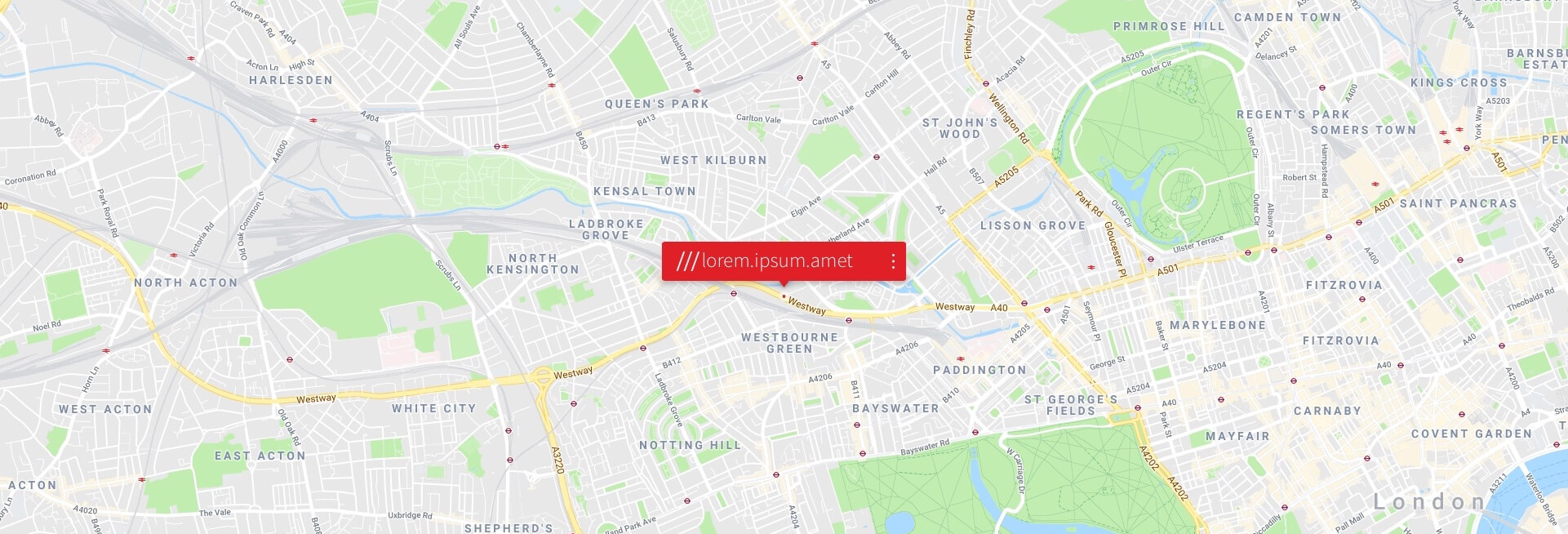
The primary surface was a full-bleed map with persistent search, satellite and grid controls, and a right-hand Inspector panel containing the address and actions to share, save and navigate.
People could discover their current location, search for a place or three-word address, refine a position to an exact grid square, save it with a label, and share or navigate to it through an external mapping app.
As Lead UX & Product Designer, I established the UX and product design workflow, wrote the UX strategy and built a React-based design system that became a foundation for what3words products. I also worked with engineers to integrate the Google Maps API across most of the product range and grew a UX team of four permanent members plus freelancers.
Challenge
The brief was to build a responsive web product that could endorse, educate and enable people to use a three-word address.
Building on Google Maps gave people familiar map behaviour, but it also risked making what3words appear to be another map or navigation tool. The interface needed to explain that what3words is an addressing system while remaining compatible with Google, Esri, Mapbox, OpenStreetMap and Yandex base layers.
The audience had widely varying map literacy. Some people had never used a map before, while others struggled to locate their own front door. The product therefore needed to help people understand the value of a three-word address while guiding them to an exact location.
People could arrive from different starting points, including a place name, their current position or a saved label such as Home. Search, refinement and saved-location management therefore had to operate as one continuous map experience.
Approach
The work began with internal workshops and a Product Audit to analyse the data, clarify the business value proposition and understand how people struggled with inaccurate or ambiguous addresses, repetitive road names, distant postcode centres and locations with no formal address.
The UX strategy used story mapping to sequence one global-consumer experience across three goals:
- Understand the premise.
- Use the system properly.
- Personalise and reuse locations.
These goals became task epics for search, refine, save, share and navigate, then user stories for the release-01 MVP. Task models and scenarios were created for Search, Refine and Save.
The design response concentrated on first use of the map: when to reveal the grid, how to make satellite view easy to reach during refinement, and how to encourage people to save their address.
In the refine flow, the map could move from a standard road view into satellite imagery while the selected address stayed locked in place. This allowed people to confirm both the general area and the exact spot without losing the address they were validating.
Decisions
I connected the what3words RESTful API to a map experience that made addresses portable beyond the product.
The share panel could expose a location as a web address, three-word address, longitude and latitude, or an address in another language. A follow-on navigation step handed the same location to Google Maps, Bing Maps or Citymapper.
Search, refine and saved locations remained connected through a map-anchored Inspector rather than becoming separate destinations. The Mark evolved as a person moved from an unsaved location to a saved and then labelled location.
The label flow offered presets such as Home or Office, as well as custom names, without removing the person from the map. Zoom levels were mapped to geographic detail, from world view at level 1 through to buildings at level 20, with the three-word grid appearing at level 19.
grid size and information map desity was taken into cosideration so th egrid whas big enough to intecat with
Results
In MVP usability testing, 66% of participants completed saving a location, 81% said the flow was not difficult, and 72% understood what what3words was after using the product.
The testing showed that the map experience was the most important part of the product. People needed a plain explanation of the three-word grid, simple ways to interact with the map and an uncomplicated route to their exact current location.
The research also exposed usability bugs, particularly on Android. Participants asked for a clearer explanation of how the product worked, better examples of available features and real-world use, direct feedback channels and ways to follow the product's progress.
These findings shaped the next round of work. The headline percentages are measured MVP usability outcomes, while the requested improvements were qualitative findings rather than additional performance metrics.
Reflection
The lesson that reframed the project was that search, refine and save are not three separate features. They are the three core scenarios from which the product needs to be designed.
Once the Inspector, search overlay and refine flow were treated as one continuous, map-anchored experience, a person could move from a rough location to an exact address and then to a reusable saved place without losing context.
The project also made the boundary between delivered work and future direction clear. Marketing, tutorials, partner case studies, user-generated stories, explorable map-based lists, public saved locations, photos, crowdsourced reports and AI, AR or VR experiences remained concepts rather than shipped features.
Prototype
Principle was used to communicate and validate high-fidelity concepts, including the full onboarding-to-save-location journey.
The flow covered searching or finding the user's position, refining to the exact square and saving it with a label.
Early Inspector concepts were sketched by hand to validate the sequence of adding a label, logging in if required, editing the label and confirming completion before visual design was applied.
Tools & Skills
Established the UX and product design workflow and defined the strategy for the product team.
Sequenced user goals into task epics, MVP user stories, task models and usage scenarios.
Used workshops, product audits and MVP usability testing to understand map literacy, address discovery and location-saving behaviour.
Grew and directed a UXD team of four permanent members plus freelancers.
Worked with executives, stakeholders, business partners and engineers across the product range.
Worked with engineers to integrate the Google Maps API and translate the responsive system into product behaviour.
Tech Stack & Methods
Provided the base map layer for the responsive browser experience.
Supported forward and reverse geocoding, AutoSuggest, Voice AutoSuggest, StandardBlend and grid-section lookups.
Supported alternate base-map providers including Esri, Mapbox, OpenStreetMap and Yandex.
Created a shared responsive component system to serve what3words web products from one design language.
Used Principle to communicate and validate high-fidelity onboarding, refinement and save-location concepts.
Accessibility & UX
Three-word addresses were available in multiple languages, allowing people to select their preferred language or the language of the country they were visiting.
Because translations vary in character count and font-size requirements, a dynamic text-resizing system adjusted the address font size so it remained legible and responsive within fixed or fluid spaces.
The product also supported people with different levels of map literacy through clear entry points for current location, search, grid refinement and saved locations.
Experimentation & Rollout
MVP usability testing focused on three moments that mattered most:
- Understanding what what3words is.
- Saving a location and registering an account.
- Using a three-word address.
The testing combined measured outcomes with qualitative observations about Android usability bugs, map explanation, feature discovery and feedback channels.
The product direction also considered future rollout through marketing, tutorials, partner case studies, user-generated stories and explorable map-based lists. These were proposed next steps rather than delivered features.
Disclaimer
This case study has been prepared for portfolio purposes and curated to comply with applicable company policies and confidentiality obligations.
Some information and details have been omitted deliberately. No confidential or proprietary information belonging to what3words Ltd has been disclosed.
The material is shared under Fair Dealing guidelines and represents my own contribution. It does not necessarily reflect the views or strategies of what3words Ltd.
Handling of information follows the Data Protection Act 2018 and the Computer Misuse Act 1990. Fair dealing is claimed under Sections 29 and 30 of the Copyright, Designs and Patents Act 1988.
Data Protection Act 2018 and the Computer Misuse Act 1990 Fair dealing Disclaimer - Sections 29 and 30 of the Copyright, Designs and Patents Act 1988.
Key facts
- Client
- what3words
- Year
- 2018
- Role
- Lead UX & Product Designer
- Industry
- Addressing & Geocoding
- Location
- London, UK
- Location save completion rate
- 66%
- Usability flow ease rate
- 81%
- Product understanding rate
- 72%
What was the challenge in what3words Map Web?
The brief was to build a responsive web product that could endorse, educate and enable people to use a three-word address.
What did I actually do on what3words Map Web?
The work began with internal workshops and a Product Audit to analyse the data, clarify the business value proposition and understand how people struggled with inaccurate or ambiguous addresses, repetitive road names, distant postcode centres and locations with no formal address.
What was the outcome of what3words Map Web?
In MVP usability testing, 66% of participants completed saving a location , 81% said the flow was not difficult , and 72% understood what what3words was after using the product . Measured outcomes: Location save completion rate: 66%; Usability flow ease rate: 81%; Product understanding rate: 72%.